Welcome & Introduction

Look around and you will see many examples of notations and ‘information artefacts’ - things made with notations. This website is itself one, with its chapters and subheadings, its table of contents and its cross-references, even its page numbers. Check out the time –another example; one notation uses two hands and a dial, while another uses an arrangement of digits. Your list of emails or text messages – yet another kind of information artefact.
Every now and again someone needs to make a new notation, or a new information artefact. The trouble is, there is no guidance. You wouldn’t make a chest of drawers without having some ideas about how to join pieces of wood together, but luckily there are dozens of book sand websites explaining basic woodworking. That simply isn’t true when it comes to notations. There are books explaining individual notations – maths notation, juggling notation, chess notation, chemical notation, and above all music notation – but no books that we can find about how to design a notation; so someone wanting to make up a new notation has to go by trial and error. There don’t even seem to be any books on how to compare two notations that already exist and think about which might be more useful. That might be unfortunate, because not all notations are equally good for their intended use.
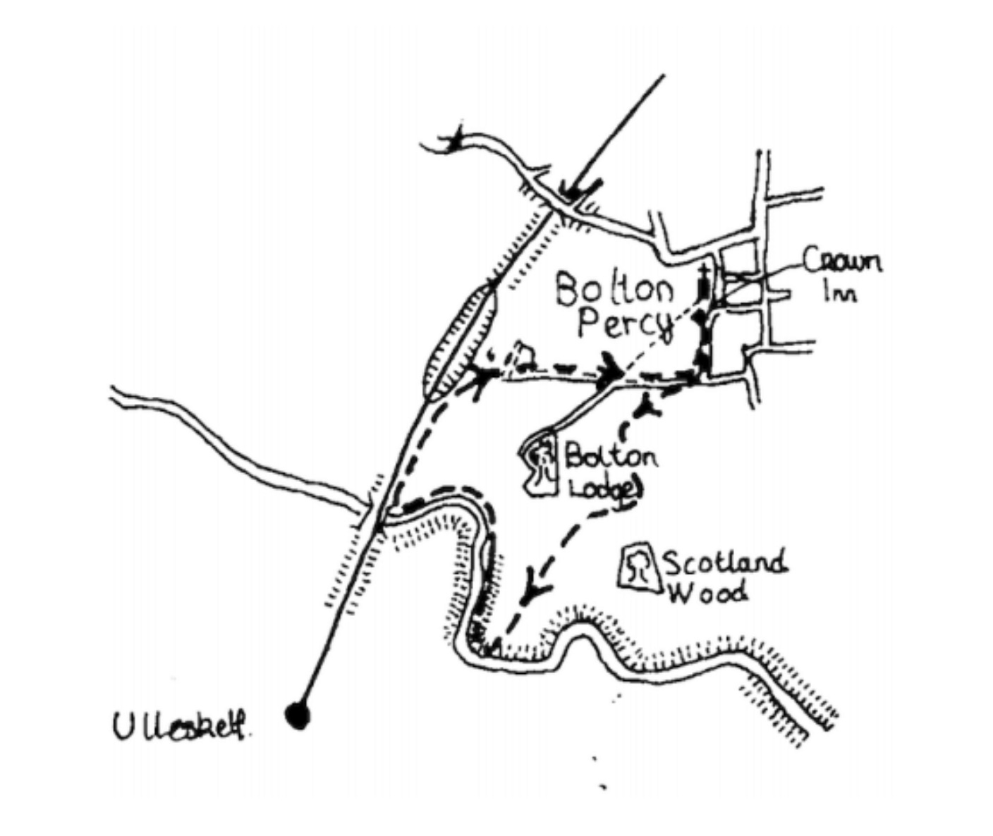
Nor does here seem to be anything written about how notations develop as time goes on. They don’t normally just sit there unchanging; they might get improved, or they might get replaced by other notations covering the same ground in a different way. What are the pressures that cause these changes? So here is our attempt to supply a guide for notation users and makers and their friends: a book about notations and about the things people make with them, about how to decide whether a notation will be good for what it’s meant for, about what to keep in mind when designing a new notation, and a collection of other notations that we find curious or useful. Let’s compare a couple of notations for something very simple and familiar, a short walk. First, we have a sketch map.

Then we have the same information, as a verbal description:
Leaving the car park [of The Crown Inn], turn right along a metalled road to a junction. Turn right again to a sign marked ‘Private Road – Bolton Lodge’ and left along a track. Mounting a stile on the right, bear diagonally left across a field to a second stile and walk field-side to a point equidistant between two woods. Turn right across a field to the apex of a hedge and follow the hedge line right to a third stile and turn left. Etc.
Since the same book contains both versions, there must be pros and cons for each style. The first version, the sketch map, gives the reader a feel for where everything is in relation to everything else. Even if you only have the map, if you get lost but you chance upon something recognisable, you can re-orient yourself. Less so if you only have the text version:if you miss a turning, you have very little chance of recovering yourself. But the text version has its pros – it might say “good view from here”, or it might mention a stile, as this one does, so readers who don’t wish to climb stiles will know to avoid this walk. (A stile is a passage between fields, with an arrangement of steps that allows people but not animals to climb over a fence or wall.)
So there are pros and cons for the person reading the notation. But there are different tradeoffs (pros and cons) for the person who is creating the notations. If they want to add a bit, say a detour to an interesting detail they forgot about, then – unless they have some rather advanced tools, not just pen and paper – changing the sketch map will involve them erasing and redrawing, possibly having to change the scale, whereas adding a phrase or two to the text would normally be very simple. Later we shall use the terms closeness of mapping and viscosity. There is a close mapping between sketch map and the world, because the shape of the notation has something in common with what is being described; but it is relatively viscous, because it resists being quickly changed. (Bold italics introduce technical terms we shall use through this book. Terms will be discussed at length later, and thumbnail definitions can be found in the glossary.)
These look like obvious ideas, once they’ve been pointed out. And so they are. What is new is not the concepts themselves, but bringing them to the front of your mind, clarifying them, and crucially, giving them names, such as viscosity. Without names there can be no discussion, neither with yourself in the future nor with someone else; and what we are proposing can be thought of as a set of ‘discussion tools’.
The general theme of this book is that the structure of notations affects what they are best used for. Our framework of terms attempts to give names to the general structural properties of notations.
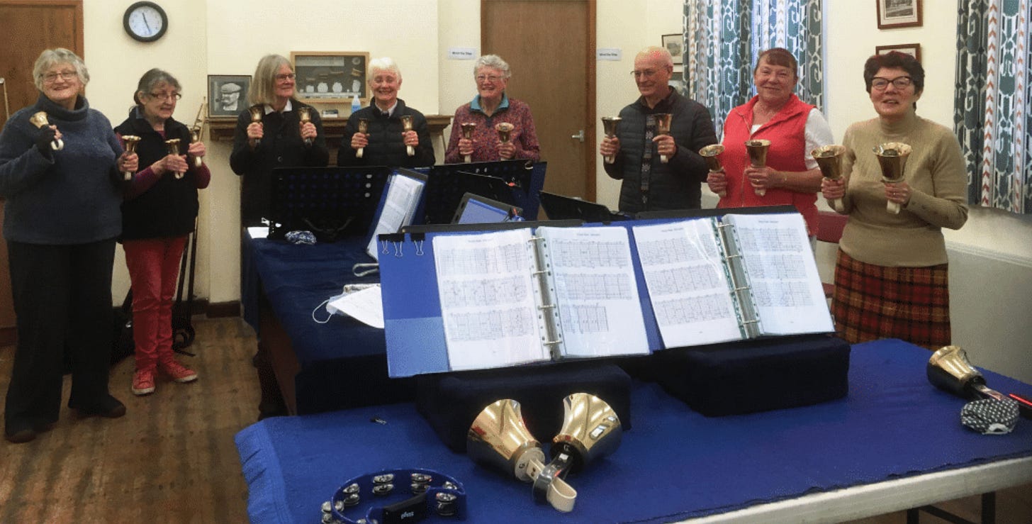
Let’s take another quick example. This is a musical example, but you don’t need to know anything about music. Handbell ringers– people who ring handbells to make music–obviously need a way to notate what they do, but many handbell teams prefer not to use standard piano-like music notation because it takes time to learn it; instead, they use a numerical notation.

The notation has to express when to play each bell. Since the bells have numbers, pretty much all that is needed is to make a sort of graph, with time going from left to right, and show the moment that each bell is to be played. Each player holds one, two, or for advanced players four bells, and follows along the graph waiting for their moment to sound their bell. (Sometimes bells are placed on a table and lifted when needed, but the notation is the same.) Here is a well-known tune:

This notation works well for the bell-ringers. However, it’s not easy to create these grid-based scores, especially because some of the faster notes (as in the fifth bar in the figure above) actually lie on the grid lines – a difficult trick in something like a spreadsheet which otherwise might make a good start. Published music in this notation seems to be hand-written, presumably for that reason. (At this point, you might like to try it out. Have a look at our demo section, http://tgworkshop.me.uk/bookdemos/handbells/, and try ringing a virtual handbell.)
Here’s a contrasting notation, where the handbell pattern from the figure above has been represented in a very off-putting way:
[ [2, 'bell5'], [2, 'bell4'], [2, 'bell3'], [2, 'bell5'],
  [2, 'bell5'], [2, 'bell4'], [2, 'bell3'], [2, 'bell5'],
  [2, 'bell3'], [2, 'bell2'], [4, 'bell1'],
  [2, 'bell3'], [2, 'bell2'], [4, 'bell1'],
  [1, 'bell1'], [1, 'bell0'], [1, 'bell1'], [1, 'bell2'], [2, 'bell3'], [2, 'bell5']
]
Another representation of the same five bars: “Play bell 5 then wait 2 ticks; play bell 4 then wait 2 ticks”, etc.
What would be the pros and cons? The earlier version would probably be much easier for players to read and play. In our jargon, we call that better usability, and it’s due to perceptual coding, just as we saw before – that is to say, if the bell is higher on the page, the note is higher to the ear, and similarly for other aspects. But what if your handbell-ringing friends discover you’ve left a bit of the tune out, how will you rewrite the ‘score’ to put it in?Is that easy, or do you have to start from scratch? In the first notation (Figure 3), there would need to be a good deal of ugly cut-and-paste or even a complete rewriting; whereas because the second notation (Figure 4) is pure text, an extra bit can be inserted trivially without changing anything before or after the insertion (Figure 5). Pure text is much easier to create and edit by software, too. In other words, the text notation is less viscous – assuming, of course, that we’re using a word processor. Not if we’ve carved the text on stone, or spray-painted it on a wall.